散点图
import matplotlib.pyplot as plt
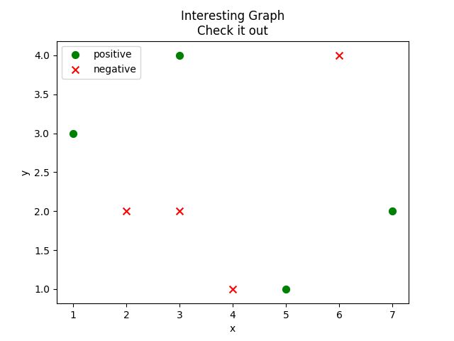
x1 = [1,3,5,7]
y1 = [3,4,1,2]
x2 = [2,4,6,3]
y2 = [2,1,4,2]
plt.scatter(x1,y1, label='positive', color='g', s=50, marker="o")
plt.scatter(x2,y2, label='negative', color='r', s=50, marker="x")
plt.xlabel('x')
plt.ylabel('y')
plt.title('Interesting Graph\nCheck it out')
plt.legend()
plt.show()
API文档:
https://matplotlib.org/devdocs/api/_as_gen/matplotlib.pyplot.scatter.html
matplotlib.pyplot.scatter(x, y, s=None, c=None, marker=None, cmap=None, norm=None, vmin=None, vmax=None,
                          alpha=None, linewidths=None, verts=None, edgecolors=None, hold=None, data=None, **kwargs)
Make a scatter plot of x vs y.

Marker size is scaled by s and marker color is mapped to c.
| x, y | array_like, shape (n, ) |
|---|---|
| s : | scalar or array_like, shape (n, ), optional |
| c : | color, sequence, or sequence of color, optional, default: ‘b’ |
| marker : | MarkerStyle, optional, default: ‘o’ |